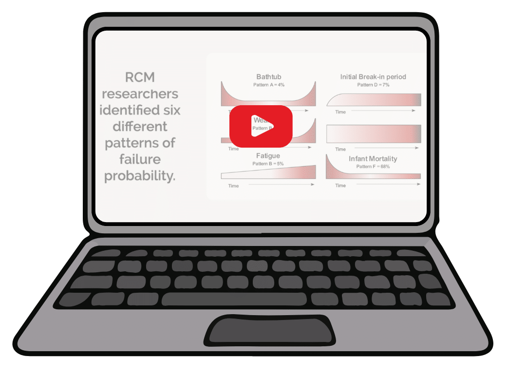
engine monitor data can be difficult to understand
Our Report Cards and Trend Reports transform vast amounts of data into easy-to-understand infographics so you can quickly detect abnormal readings and gain insight on how to address the issue.
Your aircraft’s engine monitor is a treasure trove of data, capturing tens of thousands of data points from numerous sensors on every flight. This data is key to understanding the health, performance, and efficiency of your airplane and its engine. But interpreting this data can be challenging. How do you differentiate between normal and abnormal readings? And if something is amiss, what’s the next step?
This is where our Report Card and Trend Report come into play. The Report Card compares your aircraft’s performance to all the aircraft of the same make and model in Savvy’s database. This comparison helps you understand where your airplane stands in relation to others, providing valuable insights into its condition and performance.
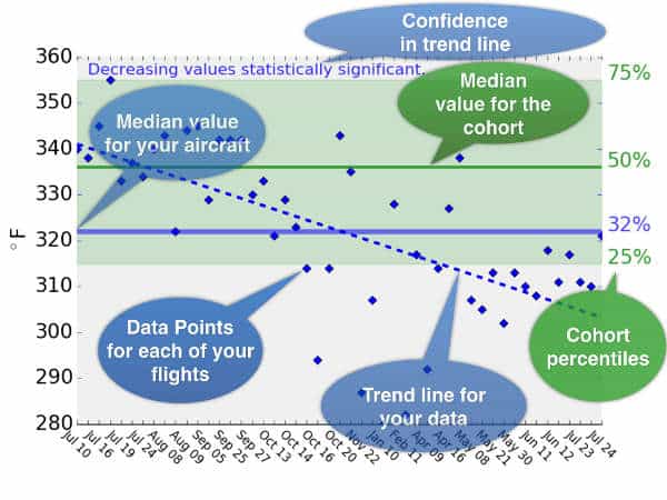
The Trend Report brings a crucial time element into your data analysis. It identifies significant and related trends such as decreasing fuel flow on takeoff causing increasing cylinder head temperature (CHT). You are alerted to significant issues before they escalate and have the information you need to diagnose problems before the cowl comes off at the shop.
Automatically receive Report Cards and Trend Reports on a regular basis, and retrieve them on-demand at any time, to stay informed and proactive about your aircraft’s health. We’re continuously expanding our database, adding new aircraft makes and models weekly. Stay ahead of the curve with Savvy.
These valuable reports are available with SavvyBasics, SavvyAnalysis, SavvyQA, or SavvyMx. Click the button below to see which plan is right for you:
Case Study
See how a Report Card and Trend Report offered Jack, owner of a Cirrus SR22, actionable intelligence about his aircraft and powerplant.
A TROUBLING REPORT CARD
Jack owns a 2016 Cirrus SR22 with a Garmin Perspective glass cockpit. (The Perspective is basically a G1000 on steroids.) His MFD records tons of data on an SD card—CHTs, EGTs, oil pressure and temperature, MAP, RPM, fuel flow, altitude, TAS, electrical bus voltages and current, even GPS coordinates—and Jack regularly uploads this data to the SavvyAnalysis platform.
Once uploaded, it’s scanned by sophisticated SavvyAI machine-learning algorithms that look for abnormal conditions like failing exhaust valves. Because Jack subscribes to SavvyAnalysis Pro, selected flights are also scrutinized by Savvy’s team of professional data analysts whenever Jack requests this, and he receives a comprehensive report on the health of his engine and the appropriateness of his powerplant management procedures.
EXAMINING THE REPORT CARD
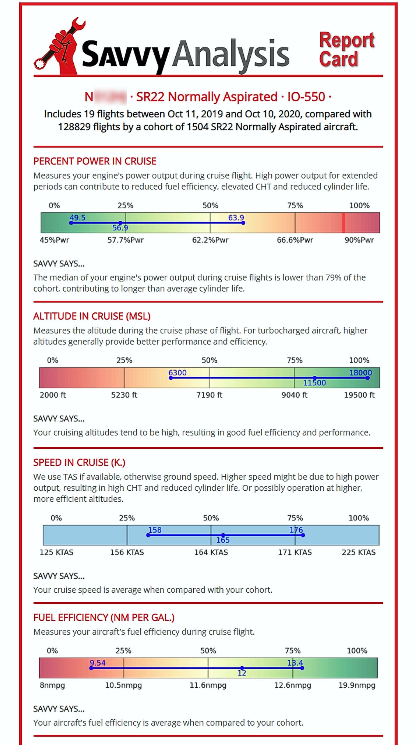
In addition, Jack receives regular “report cards” that graphically shows how his SR22 stacks up when compared to the “cohort” of more than 1,500 other normally aspirated Cirrus SR22s that SavvyAnalysis follows. The report card displays numerous parameters related to performance, efficiency, longevity and health of the aircraft and its engine, and “grades them on the curve” with reference to the cohort.
Jack was reviewing his latest report card. The section focused on the cruise phase of his flights (see image at right).
Jack thought it looked darn good. It showed that he had been operating at relatively modest cruise power (50%-64%), primarily because he habitually cruised at relatively high altitudes (median 11,500’ MSL, occasionally as high as FL180). These high altitudes allowed him to achieve better than average cruise speeds (158-176 KTAS, median 165 KTAS) and achieve better than average fuel efficiency (9.5 to 13.4 nm/gallon, median 12 nm/gallon). Not too shabby!
TOO HOT IN THE CLIMB
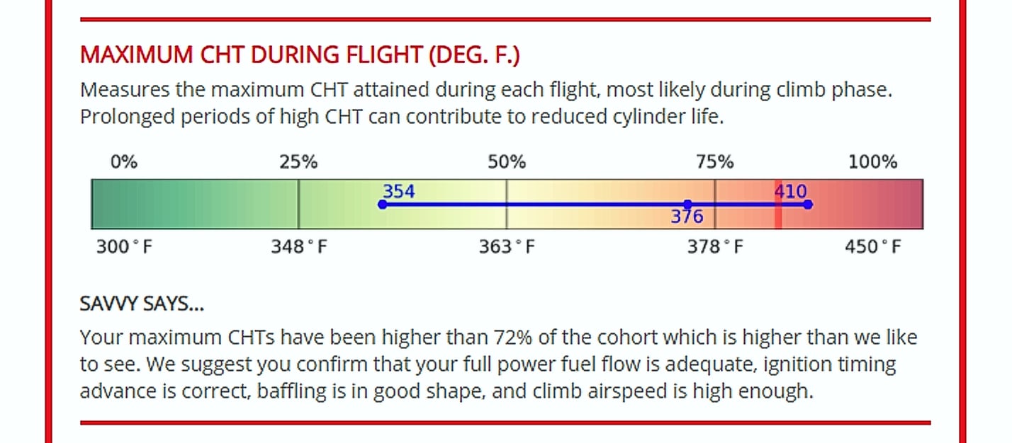
But, as Jack read further down his airplane’s report card, however, he spotted something that got his attention (see image at right).
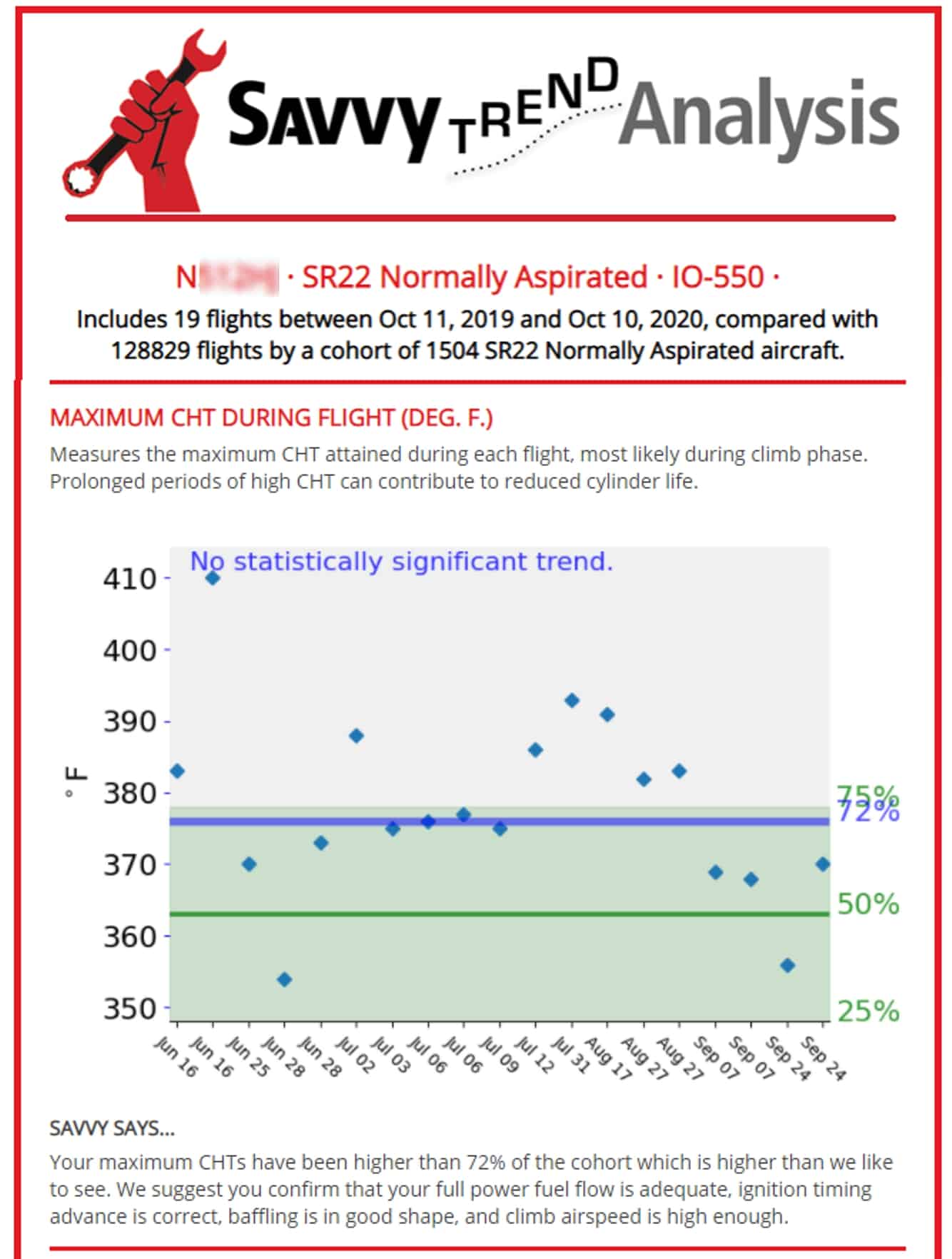
The maximum CHT during the climb phase was uncomfortably hot: median 376°F and maximum of 410°F—waaay too hot! (The SR22 has an exceptionally efficient engine cooling system, and it’s unusual to see CHTs above about 360°F in these airplanes.)
This section of the report card said “Your maximum CHTs have been higher than 75% of the cohort, higher than we like to see. We suggest you confirm that your full power fuel flow is adequate, ignition timing advance is correct, baffling is in good shape, and climb airspeed is high enough.”
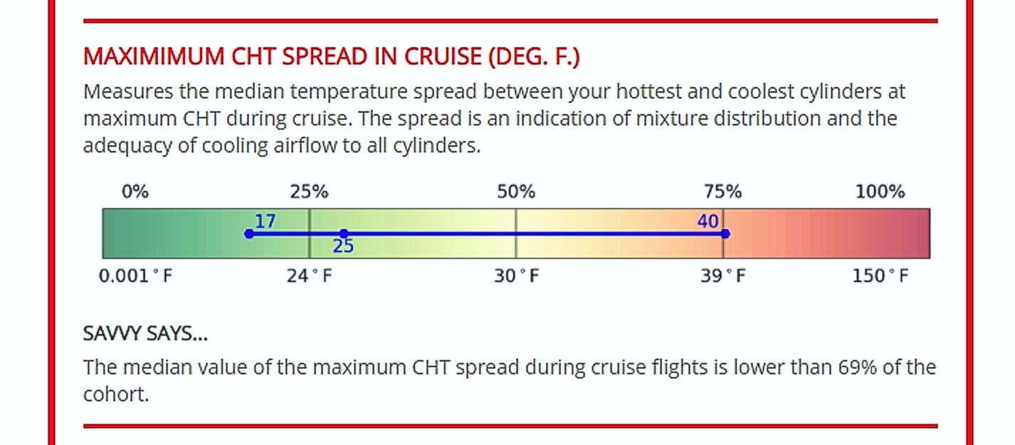
Was this a problem with engine cooling baffles that are missing or mispositioned? While that’s often the cause of high CHTs, the section of the report card that shows maximum CHT spread in cruise (see image at right) makes it clear that Jack’s cooling system is in tip-top shape. The CHT spread measures the difference between the hottest and coolest CHT, and Jack’s spread was exceptionally good, better than 69% of the cohort. So the problem must be something else.
INADEQUATE FUEL FLOW?
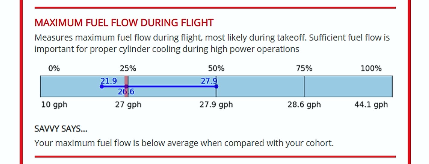
Indeed Jack’s report card clearly showed that his maximum fuel flow at takeoff power was less than it ought to be (see image at right). Jack’s median takeoff fuel flow was only 26.6 GPH, compared to the cohort average of 27.9 GPH. In other words, Jack’s fuel flow was at least 1.3 GPH too low—and that would make a big difference in engine cooling during climb. (Actually, we’d prefer to see it adjusted to at least 28 GPH.)
WHEN DID IT HAPPEN?
Jack hadn’t really noticed these high CHTs in climb, and he wondered how long this had been going on. To find out, he turned to his airplane’s Trend Report, yet another very useful report available to SavvyAnalysis Pro, SavvyQA and SavvyMx subscribers (see image at right).
The Trend Report showed that the high climb CHTs had been a problem for quite some time. The highest recorded CHT of (gasp) 410°F took place in mid-June, and all the flights from mid-July to late August had CHTs that were uncomfortably hot. Starting in September, the CHTs came down quite sharply—most likely correlated with the onset of cooler weather.
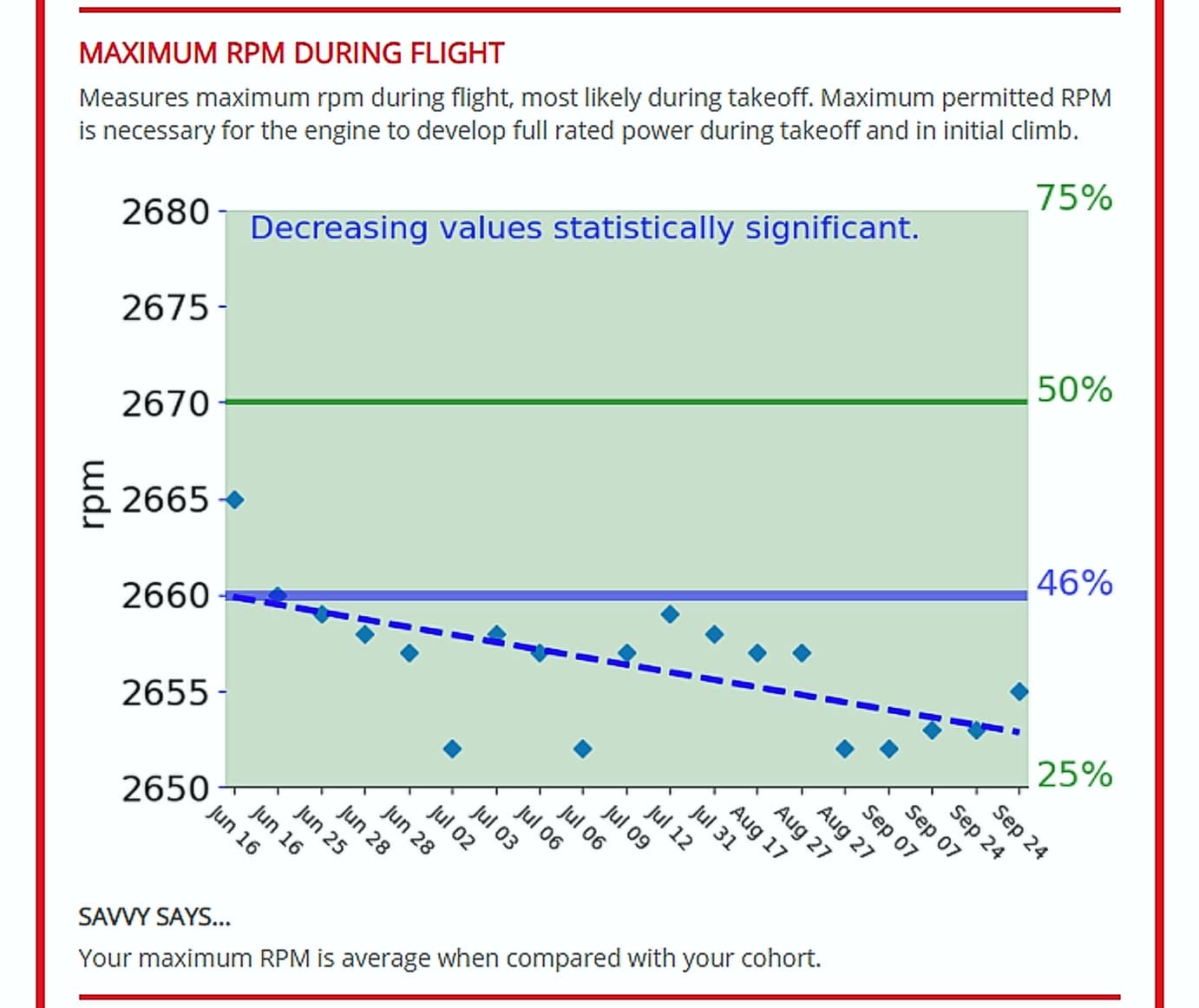
While looking at the trend report, another thing caught Jack’s eye (see image at right).
This shows that takeoff RPM for Jack’s airplane had been creeping lower over time in a statistically significant way. Maximum rated takeoff power on Jack’s Continental IO-550-N engine requires 2,700 RPM. Most mechanics adjust the prop governor slightly lower than this to avoid spurious overspeed alerts from the Garmin MFD during takeoff. Ideally, the governor should be adjusted to 2,675-2,680 RPM. However, Jack’s takeoff RPM was around 2,660 in mid-June and drifted down to nearly 2,650 by mid-September.
Jack made a note to have his shop adjust the prop governor at the next oil change.
FAQs
DO NOT EDIT
What is a Digital Engine Monitor?
A digital engine monitor is a device installed in piston engine aircraft to continuously record vital combustion parameters. These monitors typically include exhaust gas temperature and cylinder head temperature for each cylinder, with more advanced models also capturing manifold pressure, fuel flow, electrical data, and altitude.
Digital engine monitors offer valuable insights into the engine’s combustion process, helping diagnose issues related to fuel, ignition, induction, exhaust, and turbocharging systems. For example, they can detect specific patterns associated with common problems like exhaust valve failures, ignition system issues, fuel system irregularities, and induction leaks. Additionally, these monitors can identify potential malfunctions within the monitoring system itself, such as failing temperature probes or wiring problems.
What engine monitor models are supported?
Virtually all of them, both certified and experimental. In the event we come across one that we do not support, we make it our first priority to add support.
Here is a partial list of the engine monitors that are presently supported:
- Advanced Flight Systems (AF-series)
- Avidyne (R8, R9, EX5000)
- Chelton EFIS
- Electronics International (UBG-16, MVP-50, CGR-30P)
- Dynon (all models including D10/D100-series, SkyView, HDX)
- Garmin (all models including G-1000, Cirrus Perspective, G3X, GI-275 EIS)
- GRT Avionics
- Insight Avionics (GEM 610, GEMINI 1200, G-series)
- J.P. Instruments (all 700-, 800-, and 900-series)
- MGL Avionics
- Ultra-FEI/Flightline AuRACLE
How do I get my Report Cards and Trend Reports?
We provide Report Cards and Trend Reports to you in two ways:
- By email. We send you updated reports when you have uploaded 12 new flights to our platform. If you haven’t received a Report Card in the previous 90 days, we send you one regardless.
- Online from your Savvy Aviation dashboard. You can provide the date range for the flights to include in your report.
What is a Savvy Report Card?
The Savvy Report Card is an infographic emailed to SavvyBasics, SavvyAnalysis, SavvyQA and SavvyMx clients on a regular basis. It contains graphical visualizations of your engine’s performance, including the values of important operating parameters during recent flights, and compares them to the performance of other aircraft of your same make and model that we track. Operational and maintenance recommendations are provided. The Report Card is produced entirely by our proprietary analytical software, and is based on the data you and others have uploaded.
The Report Card uses a “thermometer” graphic to depict your data and compare it to your aircraft’s cohort.
What is a Savvy Trend Report?
The Savvy Trend Report is an infographic emailed to SavvyBasics, SavvyAnalysis, SavvyQA, and SavvyMx clients on a regular basis. Like the Report Card, it contains graphical visualizations of your engine’s performance, but while the Report Card shows summaries of your data, the Trend Report shows individual data points from each of your flights included in the analysis, and identifies trends that are statistically significant. The Trend Report is produced entirely by our proprietary analytical software and is based on the data you and others have uploaded. The Trend Report uses a scatter diagram to depict your data and compare it to your aircraft’s cohort.
STAY AHEAD OF THE CURVE
Start using Reports Card and Trend Reports with SavvyBasics, SavvyAnalysis, SavvyQA, or SavvyMx.
Click the button below to see which plan is right for you:
NOT READY TO ENROLL?
TRY SavvyFree.
Savvy clients at every level have access to The Savvy Platform – The world’s leading software for analyzing information gathered from piston aircraft data monitors.
Self-analyzing your engine data for free using the same powerful analytical tools our professional data analysts use with SavvyFree.
